Alight Solutions
Cutting what users want to deliver what users need

Role
Lead Designer
Timeline
Sept - Dec 2025 (4 months)
Team
Researcher, PM, Dev Leads, Stakeholders
Tools
Figma, FigmaMake, Miro, Co-pilot
TLDR
Designing against user preference and cutting a feature to protect the product.
I led the end-to-end design of a new Enrollment Questions flow, a feature that guides millions of users through personalized benefits selection once a year. I overrode research findings I believed were flawed, killed a feature added mid-project for product integrity, and shipped a system flexible enough to serve thousands of employer configurations.
Context
Annual Enrollment is Alight's Super Bowl
Alight Solutions is the HR and benefits platform for thousands of employers globally. Once a year, millions of employees log in to select, update, and confirm their benefits: health insurance, dental, vision, etc. For most users, this is the only time they interact with the platform, so every session matters.
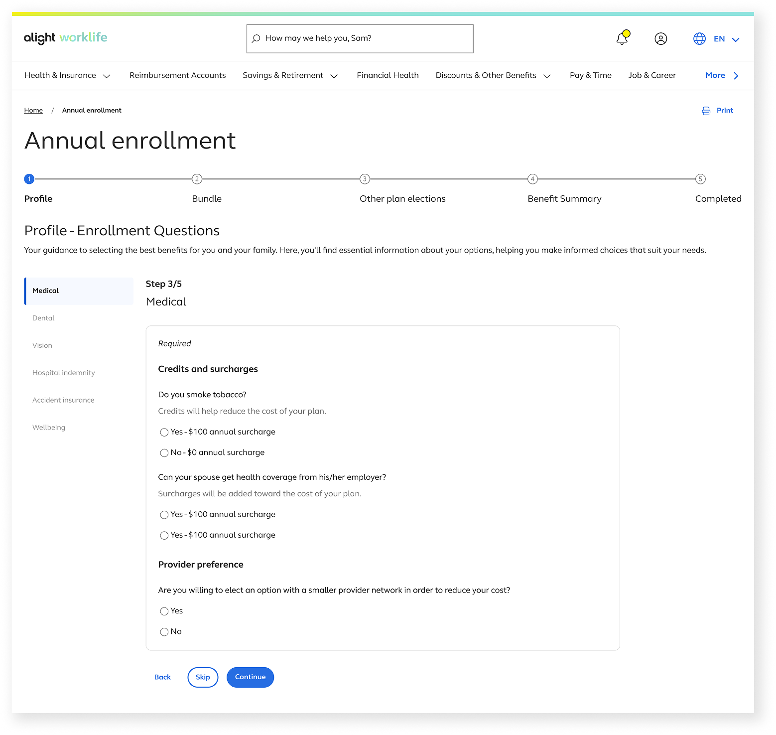
As part of a broader modernization effort, the Annual Enrollment team was redesigning the entire experience. My ownership: a brand new feature called Enrollment Questions, a guided question flow that collects health utilization data to generate personalized benefit bundles for each user. It didn't exist before and I designed it from the ground up.
Who we are designing for
The Employee
36 million direct users
Everyday employees such as nurses, flight attendants, retail workers, and teachers access Alight through their employer's benefits portal. Most of them log in once a year, during the Annual Enrollment window, to make decisions about their health coverage for the year.
They are not benefits experts. They find the process stressful, the terminology confusing, and the stakes high as a wrong selection can affect their family's healthcare coverage for an entire year. They want to get in, make the right choice, and get out.
Needs:
Clarity on what each question means and why it's being asked
Confidence that their answers are leading to the right plan
Freedom to go back and change answers without anxiety
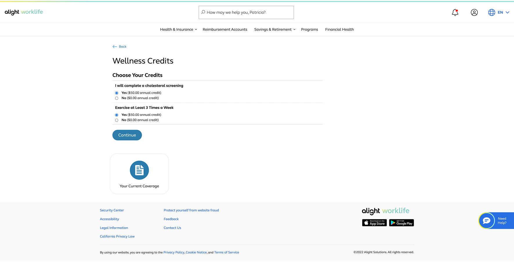
8+ pages with different use cases and some edge cases. A new navigation flow that sets expectations. A refresh of UI, replacing the old with the new.
Before
The Employer ( Alight’s Client)
4,000 enterprise clients
HR leaders, benefits administrators, and procurement teams at large companies that have contracted Alight to manage their entire benefits infrastructure. They don't use the product daily, but they buy it, configure it, and are accountable for how their employees experience it.
Each client has different benefits structures, different question formats, different coverage options. They need the platform to be configurable enough to fit their organization
The built-in complexity:
Clients sign the contracts, so their requirements come first
We hear user pain-points through their HR team, not directly from users.
Multi-client configuration design while keeping the users at the heart of it all
What I designed
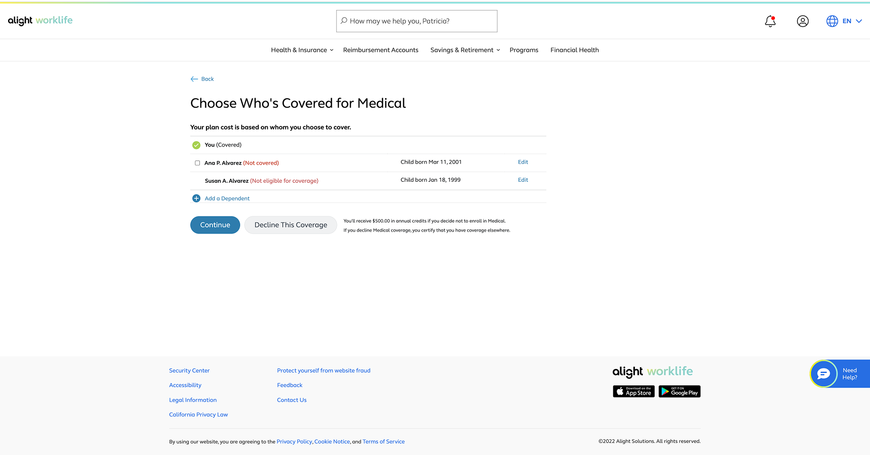
Before
After
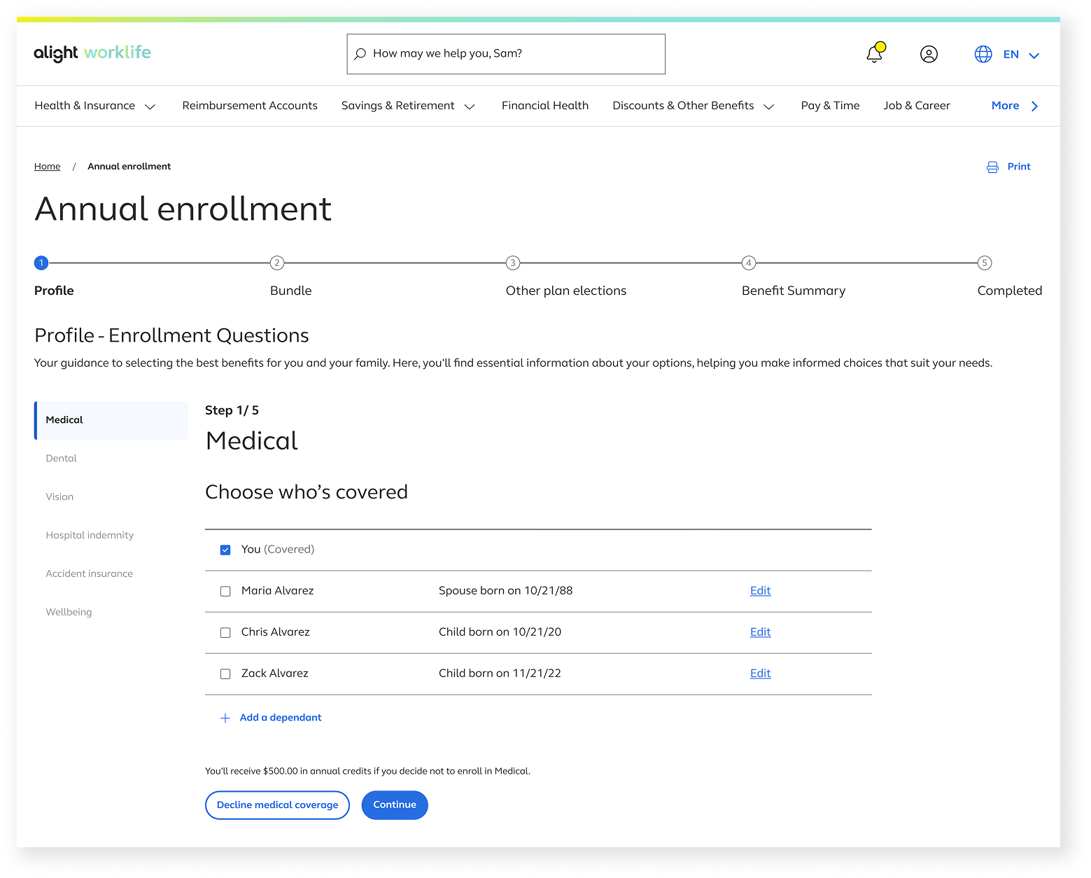
After
Alignment across teams
A lot of stakeholders. One designer. A kickoff workshop.
Before dropping components in Figma file, I ran a kickoff workshop to surface what the team thought they knew about the existing enrollment experience and more importantly, where we have assumptions and doubts.
We mapped the existing flow, identified gaps, and sketched early directions together. I then translated the strongest ideas into lo-fi wireframes and ran them back through the group for a vote. Not everyone agreed and that’s the tension I like to harness.
Ideate on winning concepts
As the outcome of the workshop, I built two prototypes specifically to stress-test that tension and to validate, get answers.
Does this function as intended? Does this make users workflow easier or more overwhelming? What concerns might clients have?
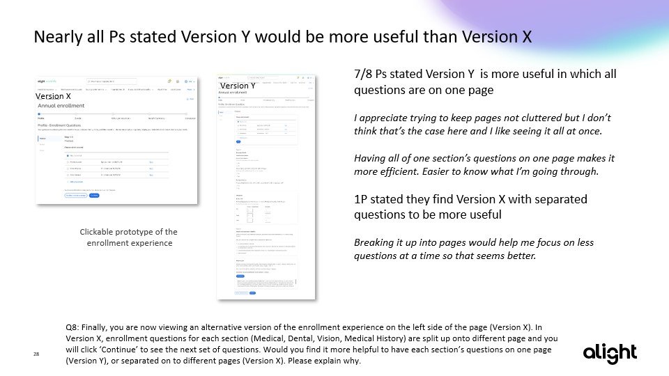
Single page
All relevant questions on one screen, filtered by benefit type. Fewer page turns. Lower perceived length. Faster to complete in a prototype.
Multi-page
One question per screen, stepped through sequentially. Higher cognitive clarity. Better support for conditional questions where one answer changes what comes next.
Concepts testing
Preference isn't the same as the right design decision
We tested functionality, not user-desirability.
The research objective was to validate navigation, the stepper, and flow clarity.
Asking users which layout they prefer at the end of test is a different question entirely.
We ran unmoderated usability testing with both concepts.
Both passed, which the research team noted was rare. Navigation worked. The stepper made sense. Users completed tasks in both flows without confusion.
End of the test, participants were asked which concepts they preferred and the Single-page won. The PM team immediately wanted to move forward with it. I pushed back.
My argument to the team
I wasn't dismissing the research.The test wasn't designed to measure preference, it was tested wether the flows worked or not and they both worked. In a controlled test environment such as this, it’s hard to test X or Y desirability.
What I presented to the PM and stakeholder group in the decision meeting
The prototype used fake data.
Participants clicked through placeholder content, and simple questions with no personal weight. Real enrollment questions involve personal healthcare decisions, and sensitive choices. The cognitive attention of the actual product is different from what we tested.
UX principles of cognitive load.
People make better decisions one step at a time. A single-page layout might look simpler and appears to accelerate the flow, but it would overwhelm the user. Multi-page allows users to have more control over the pace, one topic, one task, one screen.
The outcome of that conversation
The team agreed to move forward with the multi-page layout. Not because of my argument but because the reasonings held up. The PM became an advocate for the decision by the end of the meeting.
Mid-project pivot
Six weeks left to deliver, leadership introduced a new requirement: a Summary Page where returning users could review all their previous year's answers in one place before starting the flow. This would also include at least 6-7 more pages to design from scratch as users need to go in to edit. Now, my rebellious phase ended after high school with a bad tattoo, I don’t usually aggressively pushback on ideas, but I care about the product and the team and I want to make sure we deliver a good product.
Though I have tried to pushback verbally, majority voted yes to the Summary page. Within a few days I started drawing it up and realized the solution wasn't fitting. It did to work visually, it did not work navigationally, and especially did not work within the deadline.
A second pushback on a feature leadership wanted
Instead of designing a summary page and with the concerns, I stopped and asked what exactly are we trying to accomplish with this page?
The answer: to help returning users avoid re-answering the same questions from blank every year.
I started to wonder, maybe that goal didn't require a new page. What if we just provide pre-filled answers from previous year's responses directly within the existing flow, with a clear visual indicator that answers were pre-filled and reviewable. No new page. No new navigation pattern. No new components. No scope creep.
We tested anyway
To avoid confirmation bias, I prepped both the summary page concept and the pre-fill approach for a second round of testing. Test results validated that Summary Page my have it’s value but would require a much more design deep-diving to be fittied for user needs.
Summary Page finding Users consistently described it as overwhelming , too much information at once, unclear what needed action vs. what could be left alone.
Pre-fill finding Participants immediately understood the pre-filled banner. They knew what had been carried over and what they needed to review. No confusion.
The outcome of the test
The summary page had real value but it needed to be excuted well and prepared. We did not have enough time or resources for that. Shipping it lukewarm under deadline would have been worse than not shipping it at all. I suggested that due to time constraint, design cannot push for new flows or components to ship in time. The Pre-filled banner can still solve the problem while we can continue to explore the Summary Page concept post-MVP.
What shipped
The multi-page layout that I steered the stakeholders on.
The pre-fill that replaced a Summary Page feature request that came from leadership.
Component enhancements usable for other products enough.
A tested functioning navigation flow.
0 Scope Creep
The Enrollment Questions feature shipped without introducing new scope beyond the original brief
4-months Deadline met
Designed and tested 2 concept, built a brand new flow.Protected the timeline by eliminating Summary Page scope
Pending - Task completion rate average minutes
Post-launch we will evaluate the analytics of time to task completion and drop of rates.
Reflection
This wasn't a perfect project. Here's what I learned from where it.
Account for research environment and make better judgement.
Before this project, I would have treated "users prefer X" as a strong signal to move toward X. This project rewired my thoughts to be more critical when connecting research data with the conditions they were under.
Designing for scale forces better decisions.
Having to design a system that works across 4,000 different employer configurations pushed me to make decisions I might otherwise have deferred. I have to find a pattern that will work with clients that may offer all benefits to just one benefit.
And What I would have done differently
Set success metrics and product roadmaps early
We never established the success metrics nor the roadmap at kickoff. That gap created the conditions for the summary page to land mid-project, with no solid foundation of what success looks like.
Reframing a requirement over rejecting it.
When leadership added the summary page, my first instinct was to flag the risks and push back or under the pressure of the top, I’d comply. . But understanding the problem led to a simpler path with the same outcome. The quick fix saved us working hours and effort.