Optimizing field search from 10 minutes to seconds
A usability-led redesign of pasture field search for Brazilian ranchers, from UX failure into a seamless experience.
Role
Lead designer + Researcher
Platform
SaaS
Timeline
8 weeks
Context
Landvisor: Weed control at satellite scale
Landvisor Brazil, built by Corteva Agriscience, gives Brazilian pasture ranchers a high-tech way to monitor and manage undesirable weeds through satellite imagery combined with AI. It identifies weed density across acres of fields, before it becomes a costly problem.
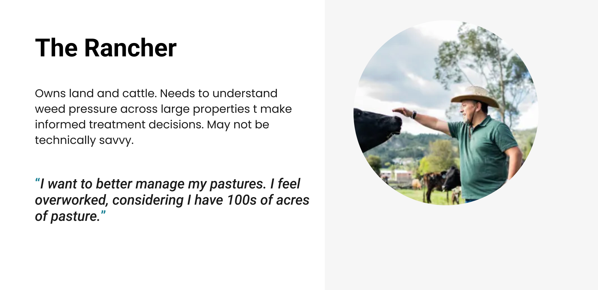
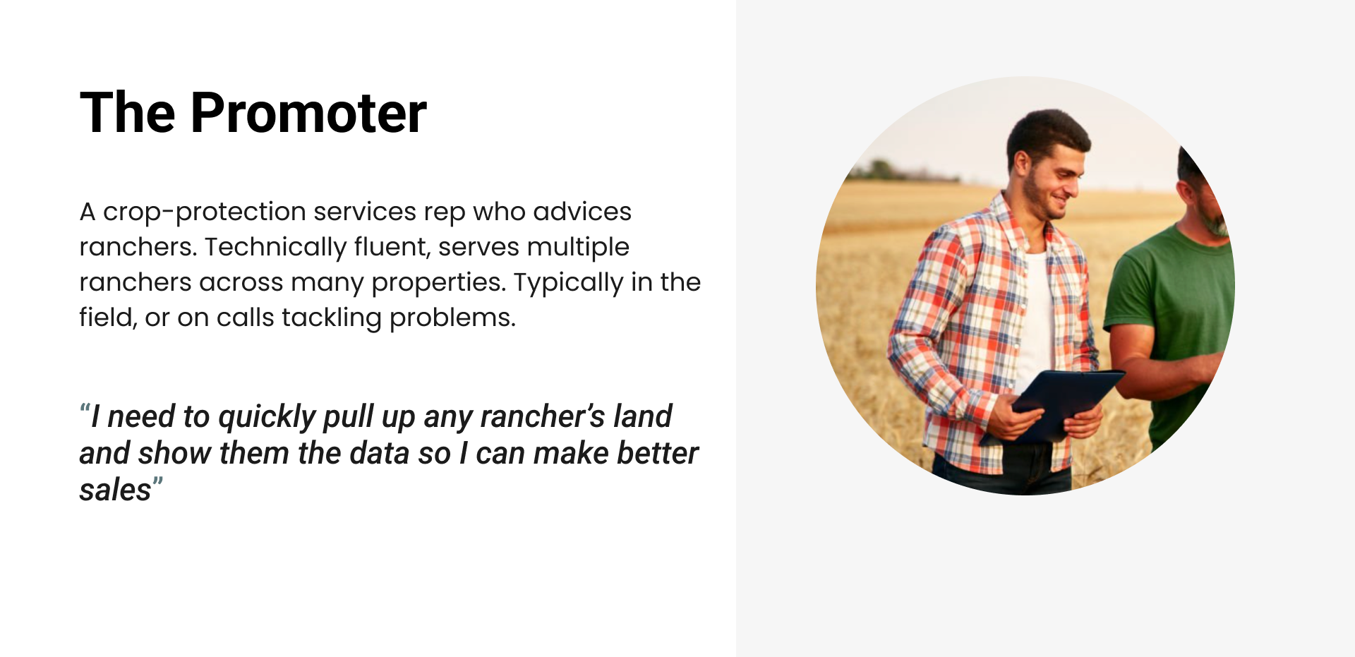
The Users
The product involves touch-points of 2 key users. A rancher who owns the land and cattle, and a promoter who serves the rancher by helping them make decisions and directly provide crop protection services.
Goal
As the first product from Corteva entering Brazil pasture market, the launch needs to be successful. And success in Brazil means the company will have opportunity to scale to other countries with prominent pasture industry, such as Argentina.
Weeks from its premier launch and my team accelerated a pressure-test with real users, surface any critical failures, and fix them fast before launch.
Usability Test
Testing with a language barrier
While I can speak Spanish perfectly to order a cerveza in Mexico, our users are in Brazil and we didn’t have any Portugese speaking designers nor researchers. To be resourceful, I reached out to our Product Marketing Manager who does speak Portugese to facilitate while I observed reactions, body language, and technical issues in real time. We debriefed immediately after each session while observations were fresh. I also gave guidance on interview facilitation to prepare him for success.
5 sessions
Mix of ranchers and promoters. Conducted over zoom with the live product in order to surface both usability and potential bugs.
1-1.5hr per session
More than a task completion test, this gives participants enough time to be familiarized and comfortable with the test format, and walk through the workflow to observe any reactions.
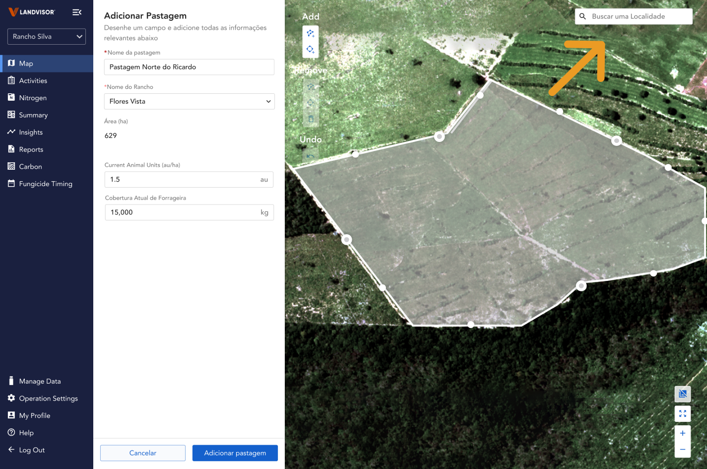
3/5 participants struggled searching for the pasture with the current interface.
Language barriers
Sessions were in Portugese. Design team observed silently, focused on reactions and body langague, and debriefed with the facilitator after each session.
Critical finding
One participant spent 10 minutes just trying to locate his own pasture on the map. Even when the team offered to skip ahead, he refused saying, "I really want to find my land, I just want to see it".
This emotional statement resonated with the stakeholders and myself and became the core of our reiteration
Note: Throughout the hour long research sessions, we uncovered other insights too as the entire flow was tested. For this case study only the search interaction is hi-lighted for deep-diving purposes.
Design process
Understanding the root cause to redesign
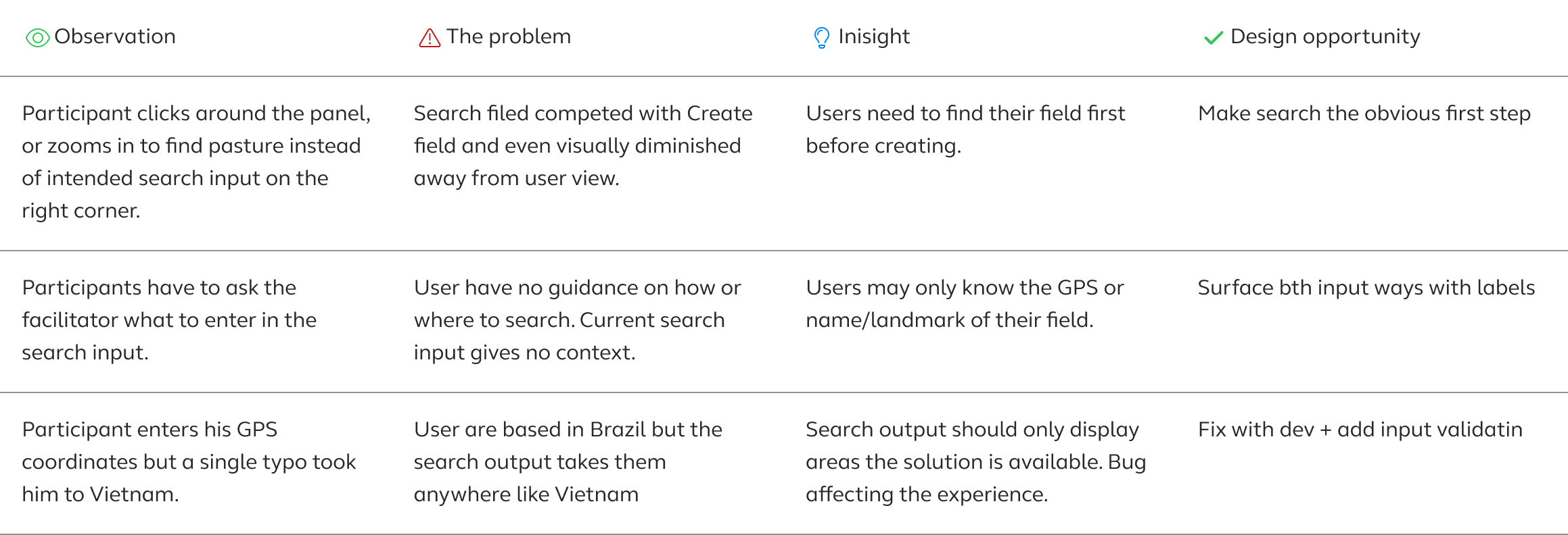
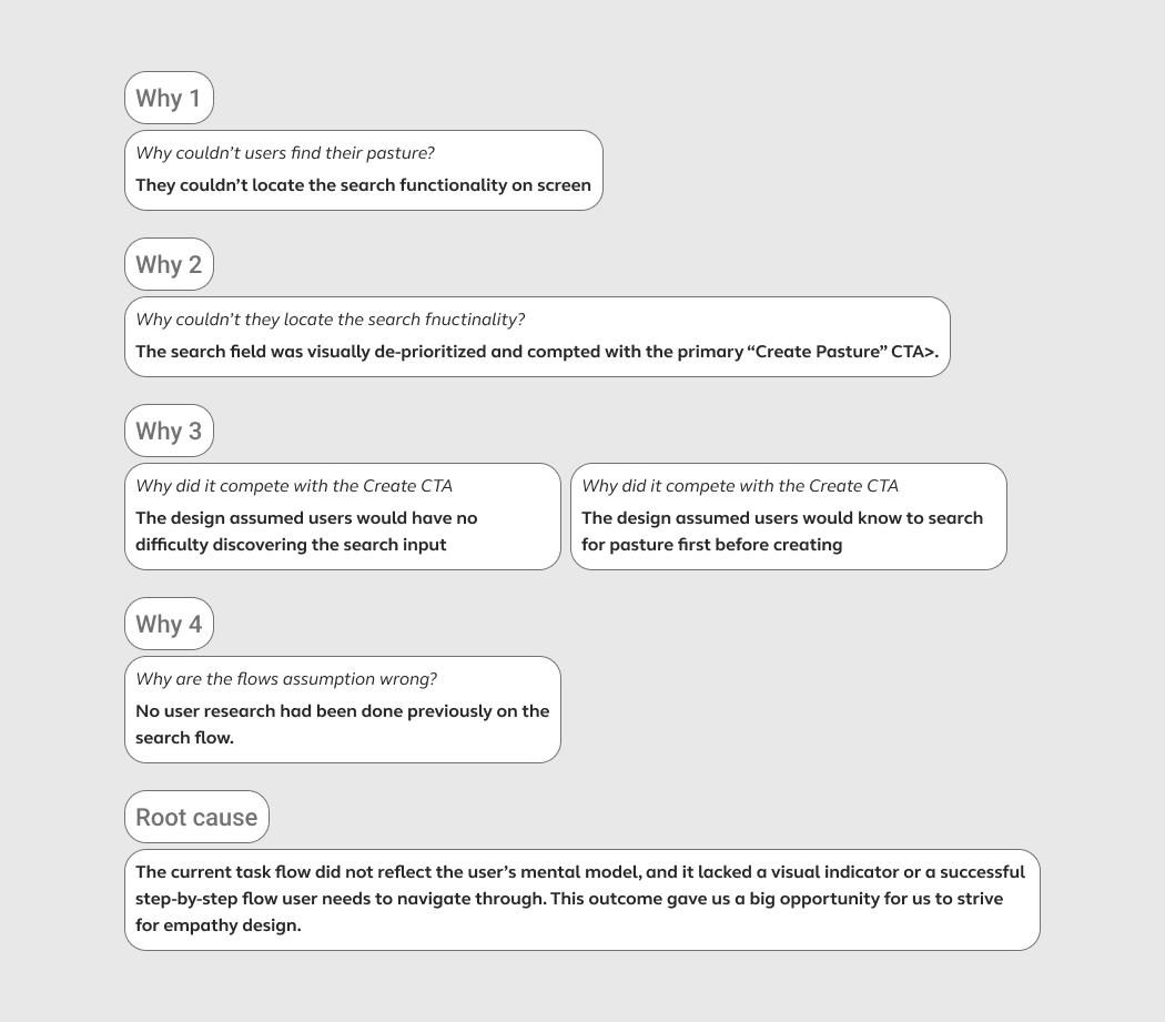
Rather than jumping to solutions, I used the Sakichi Toyoda 5 Whys method to trace to problem. Doing so, I discovered a lack of empathy in information hierarchy.
Constraints that guided the design
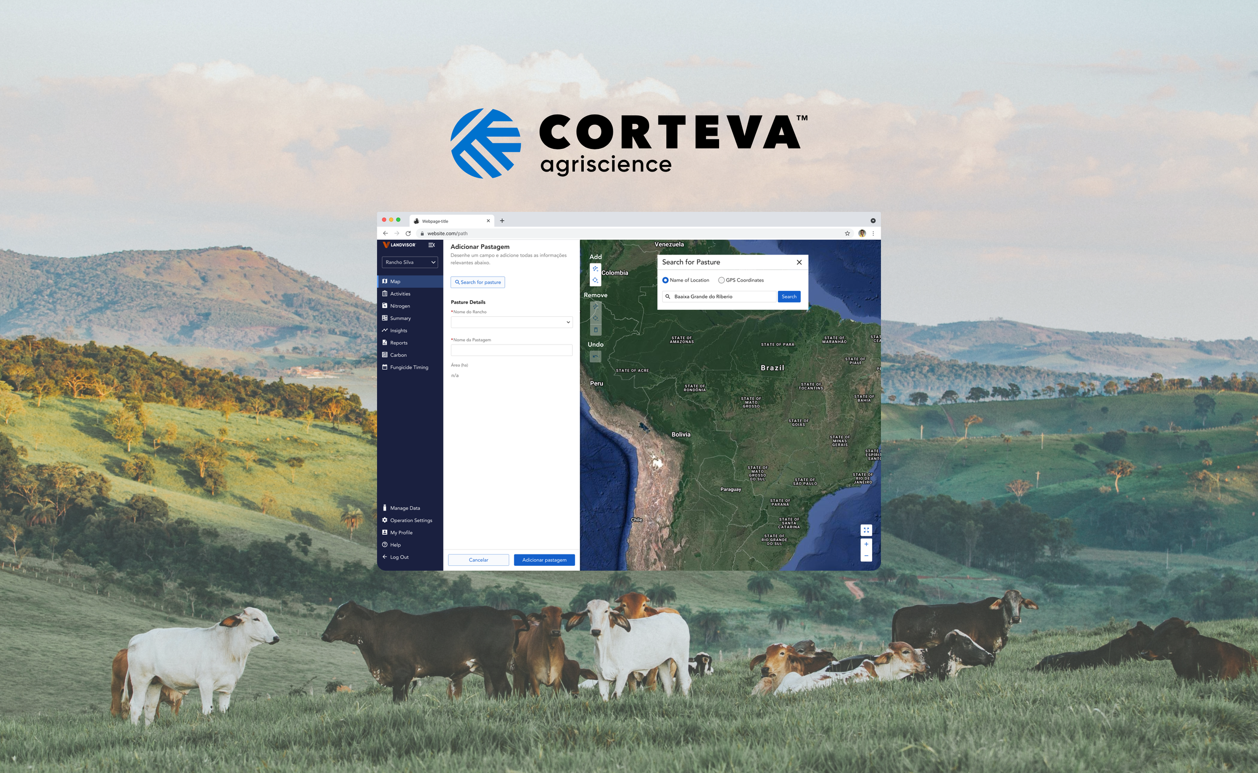
1. Search for pasture must be the obvious first step. When users interact with the interface, it should be immediately clear how and where to find their pasture. No aimless clicking, no navigating away from the search area.
2. Built-in contextual help Rather than a single generic search input, the form should guide users toward how to search, supporting both GPS coordinates and location name. Users in rural Brazil may only know one or the other, so the design needs to meet them where they are.
Several design iterations with pros (green) and con (red) notes:
3. Design system integrity The solution must not introduce new patterns. Every change has to live inside the existing component library.
Final design
Iteration based Information hierarchy
Through close collaboration with design, product, and engineering we worked through reviews, iterations, and bug fixes together.
What made it the winner over the others:
The winning design was chosen because it directly addressed the root cause uncovered in the 5 Whys , an information hierarchy built around the wrong assumption. Where other concepts buried search inside the form panel, this prototype made it the first, obvious step.
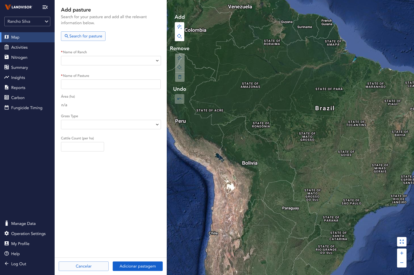
1. A clear entry point
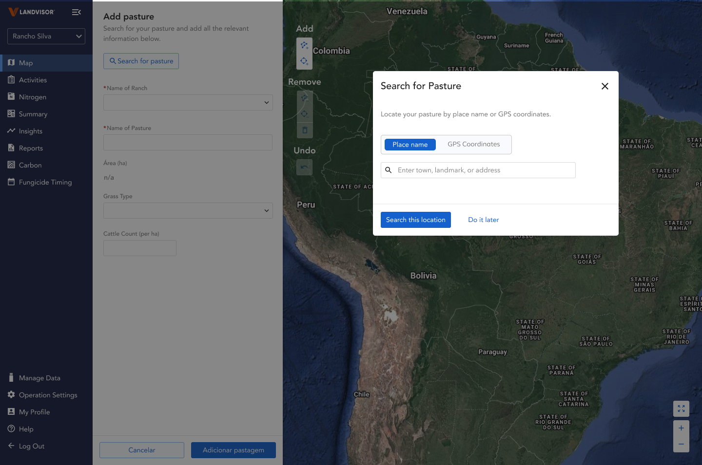
Unlike earlier concepts that embedded search inside the form panel or used a generic modal, this design made 'Search for pasture' a visually distinct with a dedicated button.
2. Two search mode for one work flow
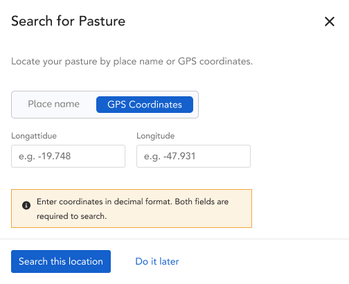
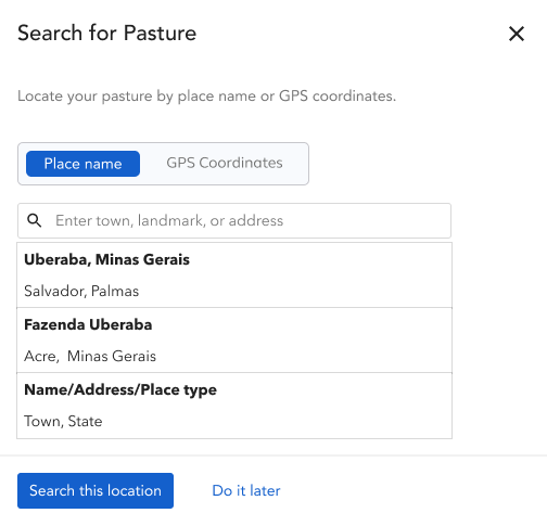
Search button opens a modal, where users have both ways of searching for their pasture.
The rancher may only know their land by name or rough GPS coordinates, not a formatted address, that's why the toggle between search modes matters for them specifically.
The promoter needs to locate their client's pasture efficiently, often across multiple properties the compartmentalized step-by-step flow serves their workflow
3. Guardrails to avoid misdirections
Additionally, the dev team implemented some guardrails on search result, removing the risk that caused one participant to end up in Vietnam during research.
Along with that, content was added to give users more guidance on how to search for their pasture.
4. One task at a time
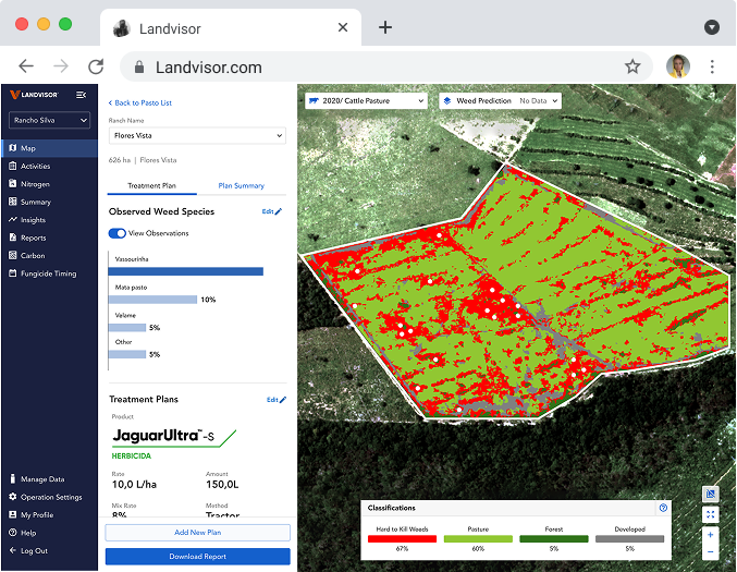
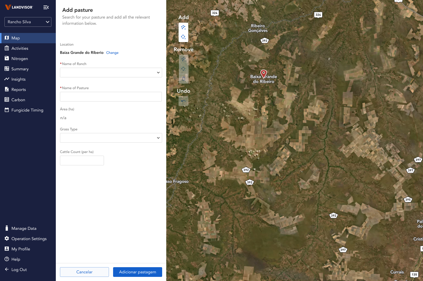
Once the search is complete, user can move on to filling out the form. This compartmilization of task allows user to tackle their goal step by step.
With the live product still in development, waiting for a production build wasn't an option, so we made a choice to run an unmoderated usability test on the high-fidelity Figma prototype in parallel.
The test was designed to measure two things: task completion time and navigational mental model fit , specifically, whether users intuitively understood the new search-first flow."
7/7 validation
Every participant immediately clicked toward the search button, no clicks outside of the button. All users successfully navigated the modal to locate their pasture without guidance.
Outcome
The task completion time dropped from over 10 minutes to under 30 seconds.
5. Validated under constraints
7 sessions
Mix of ranchers and promoters. Conducted over Maze with high fidelity prototype.
Reflection
Diagnose the probelm before design
This project reinforced something I believe deeply: the most important design work happens outside of Figma. A surface-level audit would have led to a visual refresh but The 5 Whys revealed the real issue , an information hierarchy built on the wrong assumption about what users needed to do first. That distinction changed everything about the solution.
What I'd do differently
Run lightweight research earlier in the product process, not just pre-launch. The assumption that users would create a pasture before searching for one could have been caught in a 30-minute discovery session months earlier.